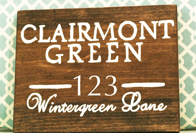
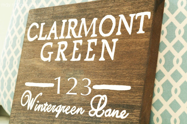
{note: I photoshopped out the house number to maintain a little privacy for my parents, so pardon the fact that the numbers look a little funny!}
This sign is a belated Christmas present to my dad (see what I mean about being "in the works" for awhile?) - to both of my parents, really - for the river house they bought nearly two years ago. Though this house is a new part of my family's life, it has already become a really special gathering place for us. It's a true retreat, and a place my parents love inviting others to share with them. They see this house as a long-term type of thing. You know, the kind of place their grandkids visit and grow up coming to for vacations and holidays. A place to make memories. (Sounds cheesy, I know, but it's true.)
The reason I'm giving you some of this background and emphasizing the family part of things is because it'll help give some context to the meaning behind "Clairmont Green," which is the name of the house. When my parents were coming up with the name, they wanted it to be something special - something with meaning. They came up with Clairmont Green because it integrates the names of two special places in my parents' lives. Clairmont Springs is the place my where my maternal grandmother grew up, and was a big part of my mom's life when she was younger. Wintergreen is the place my paternal grandparents bought a house and retired before my grandfather suddenly passed away. So they combined the two places and came up with Clairmont Green. If it's not already obvious to you, family is pretty important to us. Naming the house for two amazing families only seemed fitting, and once the house was named, I thought it would be neat to hand-paint a sign for it with the name.
Ok, now that you have a little history, let's get back to the sign itself. This project involved a lot of "firsts" for me and stretched me to be creative in carrying out the vision I had in my brain. After a little brainstorming, I decided darkly stained wood with white letters would be pretty and classic, so I mocked up a few different designs to show my parents:
They decided the rectangular one (#3) was their favorite, so we went with that one. Simple and timeless.
Then the fun part started: how do I actually make this? Like I said before, there were a lot of firsts involved here. It was my first staining project, so I got some advice from my handy father-in-law (thank you!). It was also my first time hand-painting something so intricate, so I turned to Pinterest and good-ole Google for hints on that (more detail to come on how I did that in another post!). I am definitely not an artist, so needless to say, I was a little nervous about how this was all going to turn out. Was it going to be a bust? Would I have to try multiple times?
While I may have fumbled my way through it was a bit of a challenge, I did get it right the first time (hooray!). I'm really happy with how it turned out. Hand-painted anything isn't supposed to look perfect. If perfect is what I was going for, I would've just had the letters (or the whole sign) manufactured somewhere by some pros. Like the Nester says, "It doesn't have to be perfect to be beautiful."
It's completely unique. My parents love it, and that's the important part (hey mom and dad!). I can't wait to see it hanging up in its proper place at the river.
I think this is where I'll end today since this post is getting a little long and wordy. I'm planning a post with lots of "how to" details and lessons I learned along the way. One thing I'll mention is that having the right equipment and supplies proved to be crucial to this project's success. How's that for a cliff-hanger? Ha!


Avriq
ReplyDeleteAvriq India
AVRiQ - Data Recovery<
AVRiQ Crunchbase
Avriq Services
Avriq Us
Thank you for the update, very nice site..
ReplyDeleteSign Maker West Midlands
thank you very helpful article. allow me to join to share health articles with your article hopefully useful.
ReplyDeletePengobatan Epilepsi Dengan Bahan Alami
Cara Mengobati Rematik
Cara Mengobati Penyakit Trigliserida Tinggi
Pengobatan Berbagai Macam Luka Sampai Tuntas
Cara Mengobati Paru-Paru Basah
Provided by hundreds of seminars, they announced a variety of businesses-from restaurants, hotels, nightclubs and pharmacies to jewelry, tailors and pawn shops, and at the same time announced the growing prosperity of the city. Recently, however, Hong Kong’s neon lights have disappeared at the rate of thousands per year. Instead, they burn brighter and LEDs have better energy-saving effects. When they withdrew from the field of vision, the neon sign, and the process and story behind it became a matter of preservation. It was first introduced to Hong Kong in the 1920s, and the use of neon lights exploded from the 1950s to the 1980s. Although noteworthy places can be found in the commercial corridors of Nathan Road and Wan Chai nightlife district, part of the city is not in the dark.https://neoncave.co.uk/ By 1970, the entire building façade was covered by neon lights, including the Panasonic national symbol declared by Guinness to be the largest Nathan Road in the world.
ReplyDeleteThis blog post shares the author's experience creating a custom wooden sign as a gift. The process included choosing a design, learning new skills like staining and hand-painting, and overcoming initial doubts about the final result. Despite being a novice at these tasks, the author successfully completed the project to their satisfaction. The quote from The Nester reminds readers that perfection isn't necessary for something to be beautiful. Overall, this is a heartwarming story of personal growth and creativity.
ReplyDeleteNew Jersey District Court Protective Order
Mutual Protection Orders in New Jersey
abogado delitos sexuales nueva jersey