The long-awaited kitchen update is here! If you've been following on Instagram (@mayricherfullerbe), you've seen some sneak peeks here and there on our progress, but it's high time for a full blown post on it. I wanted to share about it in real time, but quickly discovered it was almost impossible to take on a full kitchen reno
and launch an interior design business at the same time
(and still sleep!). Now that we're mostly done with the kitchen, my time is a little less crunched, and that means I can update the blog!
Last time I wrote about the kitchen, I shared the
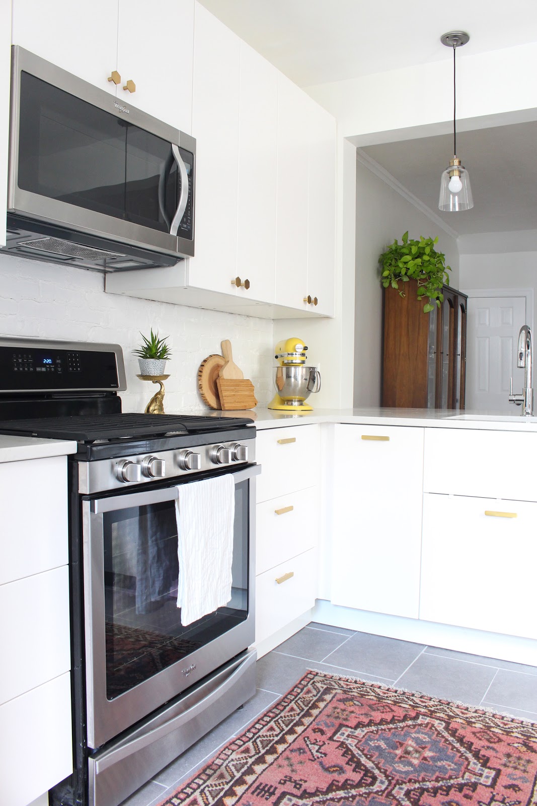
design board and plans, but as a quick catch up, here's a little about where we're headed - we're doing a modern white IKEA kitchen with quartz countertops, brass hardware and charcoal tile floors. It's a complete cosmetic gut job. There are no structural or plumbing changes, but everything else is OUT.
I'm going to break this reno up into several posts starting with the demolition and the beginning of putting it back together. It felt like it took forever, but all in all, it only took three weeks to get the major work done thanks to the amazing contracting by my father-in-law. This was his last job before retirement, and man, we worked him hard and we're so so grateful for his work!
Let's begin, shall we?
First step: take down all of the old cabinets and remove the appliances.
(If you want to see the kitchen before, check out this post.)
The main wall of cabinets had exposed brick behind it, which is pretty sweet, but it was looking totally disgusting from years of grease buildup. After a little bit of deliberation, we decided to simply clean it up and paint it glossy white to match the rest of the trim in the house. It looks like a rustic subway tile now and I love it (photos to come on that!).
Next to go was the old tile. The floors were pretty uneven, so a lot of the tiles were cracked and some had been replaced over the years with non-matching tiles. My father-in-law spent a lot of time scheming and figuring out how to make the floors dead flat so the new floors won't have a tile cracking problem in the future.
One little fun fact - we only went without a sink for two days during this who renovation. It was amazing! We waited until the very last minute to swap out the old one with the new sink and sink cabinet, so those of you who are going through or are planning a kitchen renovation, see if your contractor will work with you to do this. It makes living in a construction zone
so much less bad.
After everything was disassembled and cleaned up, we started installing the new IKEA cabinets! I spent many, many hours assembling them while my father-in-law did the skilled labor in the kitchen, but it really wasn't so bad. I had 13 cabinets and 17 drawers to assemble and let me tell you, IKEA has an incredible system that just
works. It's pretty difficult to mess up if you follow the directions. And though it's time-consuming, if you break it up over the course of a week or so it doesn't feel totally overwhelming.
Here's an awkward picture of me putting one together. You're welcome.
Ahh! New cabinets! It's starting to look like a kitchen again, right?
We also purchased a new range, microwave/hood and refrigerator for this project. I've never had new appliances in any of the places we've lived and they make me oddly happy. They have all these fancy features that I never knew I needed (ha!), but now that I have them there's no going back. :)
These two tall pantries are amazing. We put a lot of shelves and a few drawers in them and they're perfect for dry goods, small appliances and our coffee station (more on that soon...). These are helping us keep our countertops clear, which was one request from my husband, and he doesn't request much, so you know I had to make that a priority, right?
Once all the cabinetry was set, it was time to take on the radiant heat flooring project. This was on my dream wish list and I'm SO happy we decided to do it. Our kitchen gets ridiculously cold in the winter because it hangs over our garage and the outside world. These radiant heat floors will make a huge difference.
We went with a loose coil system from Warmup (best customer service ever, by the way. I can't speak highly enough of them - and no, they're not sponsoring this post!). You basically nail down these guides and then weave the wire through them, keeping the wire at least two inches apart throughout. You also want to make sure you keep the wires out from under appliances and cabinets.
Here's another fantastic picture of me for your viewing pleasure. I'm adding some hot glue to places where the wire wanted to stand up. This helps keep them from popping up when you're pouring thinset onto the system. And no, I didn't do this by myself - my father in law gets most of the credit for making this dream happen!
After a layer of thinset dries on top of the wires, it's time to tile!
Once the tiling was complete, we were done with the major stuff - minus the countertop installation - big high five!
I'll finish up today's post with a few shots of the cabinets with all the doors and drawers installed:
This little bank of cabinets on the opposite side is probably my favorite new addition. It's kind of like a floating sideboard. We put butcher block on it for a countertop and I love the warmth it brings to the kitchen. Those deep drawers are awesome for storage too! You can also catch a glimpse of the fancy new fridge. Can't wait to share details on that soon!
So that's where I'll wrap up for today. I think that's enough to take in for one day! Our countertops were install this week, so it's looking even better now. There's some finishing work to be done including painting, caulking and installing knobs and pulls, but we're thrilled with how it has turned out so far!


